As I mentioned in my previous post, I've had very little spare time the last month, with getting ready for Krillbite's Kickstarter and starting in a new part time job. I've been pondering what's important to think about when creating assets for a video game, and I believe a solid workflow is one of, if not the most, important timesavers you can have.
Too many times have I rushed ahead too many steps without consulting with other people, and 9 times out of 10 it results in me having to go back and redo something, taking away both time and morale. Though you have to be ready to redo a lot of work in this kind of work, it never gets any more entertaining to do so. So I thought I'd take you through the workflow of one of the assets I've been working on this last week, to see what I might have done right or wrong!
Most often it starts with the game designer's idea of the level, which gets handed to the concept artists who then brings the idea to life by drawing concepts of it. I say most often, because it happens that other members of the team comes up with ideas or solutions that are brought into the game.
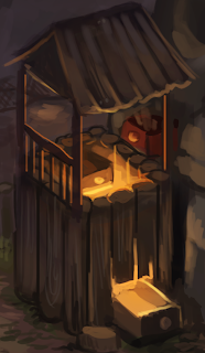 |
| Concept by Tina Alfredsen |
In this particular instance, the idea was of a climbing tower where you can use drawers to climb most parts of it. On the left you can see how the first concept of it looked. A mistake I've regrettedly done too many times is to get started right away with making the mesh as soon as I see another concept has been made, without letting people discuss it first. You might feel like you don't want to disturb other people's workflow by asking questions, but communication between the team is really important to avoid mistakes and misconceptions. Luckily, I had learned from my mistakes this time, so I didn't do any work on it before the concept artists and the game designer discussed the concept art and continued to iterate on it.
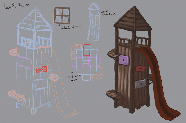 |
| Concept by Karoline Aske |
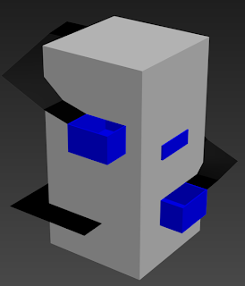
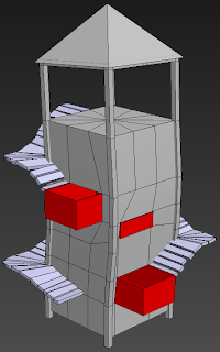
Now, the most entertaining part (for me at least) of 3D-modelling is the detailing of a model, the prettification if you will. Another mistake I've done too many times is starting directly with adding details that are unnecessary when testing the asset ingame. For the next logical step would be to block it out, or whitebox it. Whiteboxing is a method where you mostly use blocks and simple geometry without any texture, just to see how it works ingame.
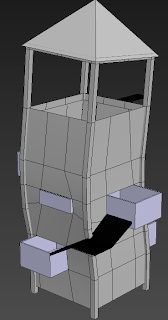
Second iteration of the tower. I've added minor details here like the crookedness, and some supports as well as the roof. This gives a greater insight to how it's final look is going to be ingame. The tower has also been slimmed down, and had some fixes on the inside that's not noticable from this view. It's still mostly simple geometry, so if anyone on the team had noticed any changes that needed to be made, it's still easy to go back and change things at this point. At certain points I like to send screenshots of it to the rest of the art team for input. If they see anything they would like changed, it's easier to change it early in the process rather than when it's finished.
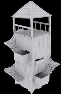
On the third iteration I've added the actual steps you're using to climb the tower. They're quite simple at this point, but gives great insight in how the look of wooden steps looks in 3D. Often we find that things doesn't look as good in 3D as it did in the concept and go for another approach. Again I show it off to either the art team or the game designer to discuss whether it looks good or if we should use another approach.
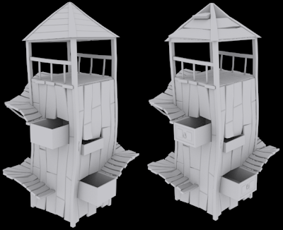
Having received the green light with how it looks, I start on what I consider the fun part, the detailing. Here I've transformed the simple geometry into wooden planks and added things like the fence and supports for the wooden steps. When working this closely on an asset for days it's normal to work yourself blind on it, making it difficult to see what the next logical step would be. Once again I asked the rest of the art team for help and got suggestions to break up the planks, 'destroy' the roof and add more randomness to the wooden steps. A common mistake I've done at this point is starting to unwrap the mesh before discussing with others. This has resulted in me having an unwrapped mesh, before someone coming over and pointing out things I could have done to make it even better. Suddenly I wasted hours on unwrapping something that needs to be redone, that could have been avoided had I just communicated more with the team before doing something.
And there you have it! A run through the workflow that at least works for me in Krillbite. I haven't added the final part of it, texturing, as the asset is actually still a work in progress. The texturing is also made by our 2D artists, so I wouldn't be able to tell you much about their process without a lot of guesswork. The most important message I'm trying to get across is that communication is key. Starting work on something without discussing things that are unclear, or just getting advice on something is a sure way to guarantee that you have to redo your work at some point. I hope this will help you in the future!
As I've also said earlier in my posts, if you have suggestions to anything I say in my posts, feel free to leave a comment on how and what I could do better and I'll be sure to listen!
As parting words I'll just be so shameless as to remind people that we currently have a Kickstarter going for Krillbite to fund the final stages of development for Among the Sleep. If you would like to see this game completed, it would help us lots if you could share the word!
Game of the moment: Monster Hunter 3 Ultimate
Happy gaming!
-Svein
No comments:
Post a Comment